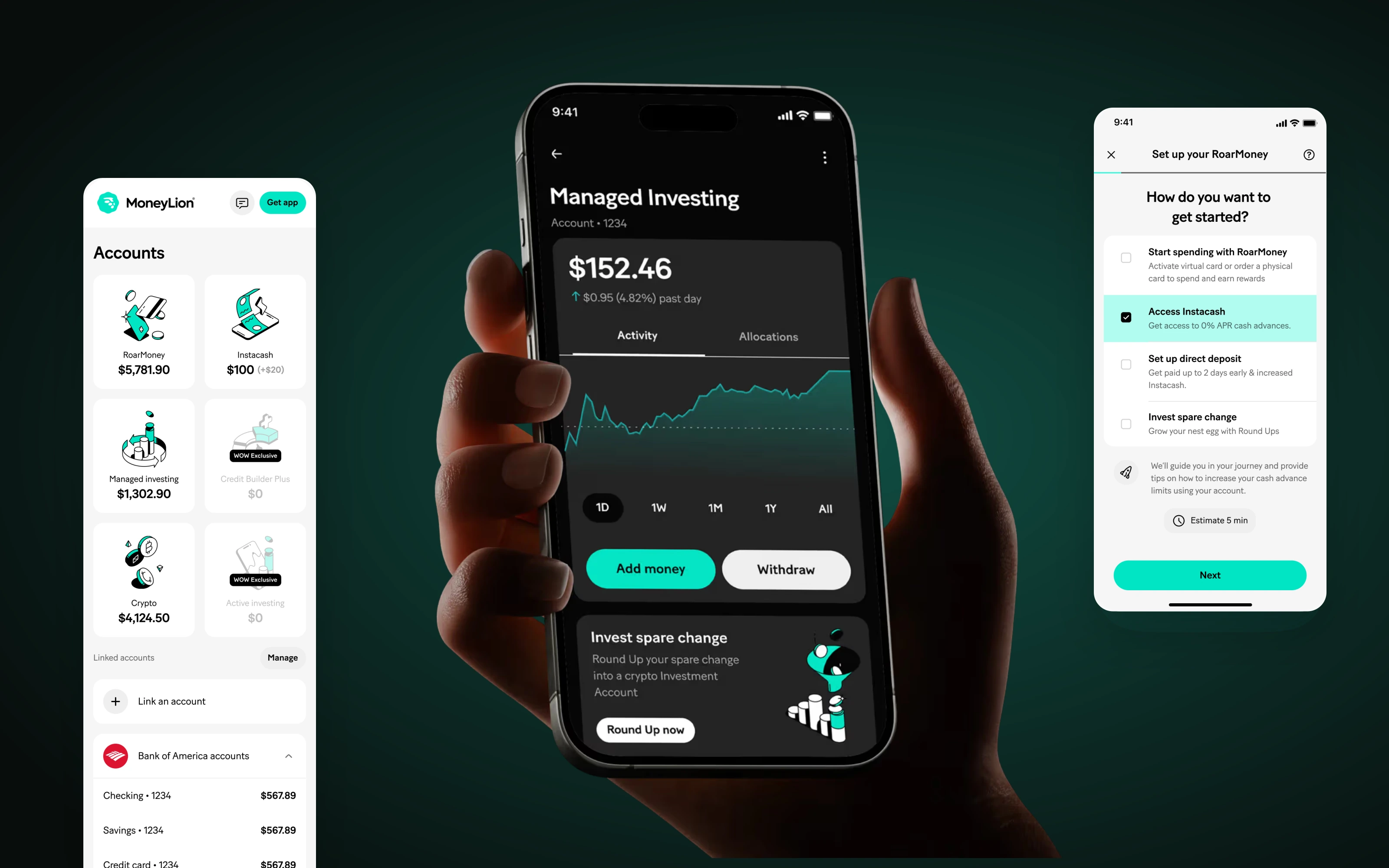
The full picture
of your money.
Everyday banking. Cash access. Financial discovery. Designing across the products that bring MoneyLion together.
- RoleLead Product Designer
- Timeline2022–2023
- ProductsRoarMoney, Instacash
& Marketplace - FocusUX/UI, design systems
& prototypes
From getting paid
to what comes next.
MoneyLion brought together everyday banking, cash advances, investing and a marketplace of financial products. My work covered several parts of that ecosystem, where people arrived with different needs and different levels of familiarity.
Working across that range meant balancing two needs: giving each product a clear purpose, while making the experience feel recognisably MoneyLion.
My role
As Lead Product Designer, I worked across RoarMoney, Instacash and Marketplace. My remit included UX and UI design, prototypes and design leadership, alongside new features, campaigns, the design system and MoneyLion’s web presence.
The work moved between individual journeys and the bigger picture: the actions a screen makes available, the way products connect, and the visual language that holds them together.
Make the next
money move clear.
The RoarMoney work covered the journey from setting up an account to using it every day. Funding, card selection, activation and transaction details each needed to communicate what was happening and what to do next.
Start with what matters to the customer.
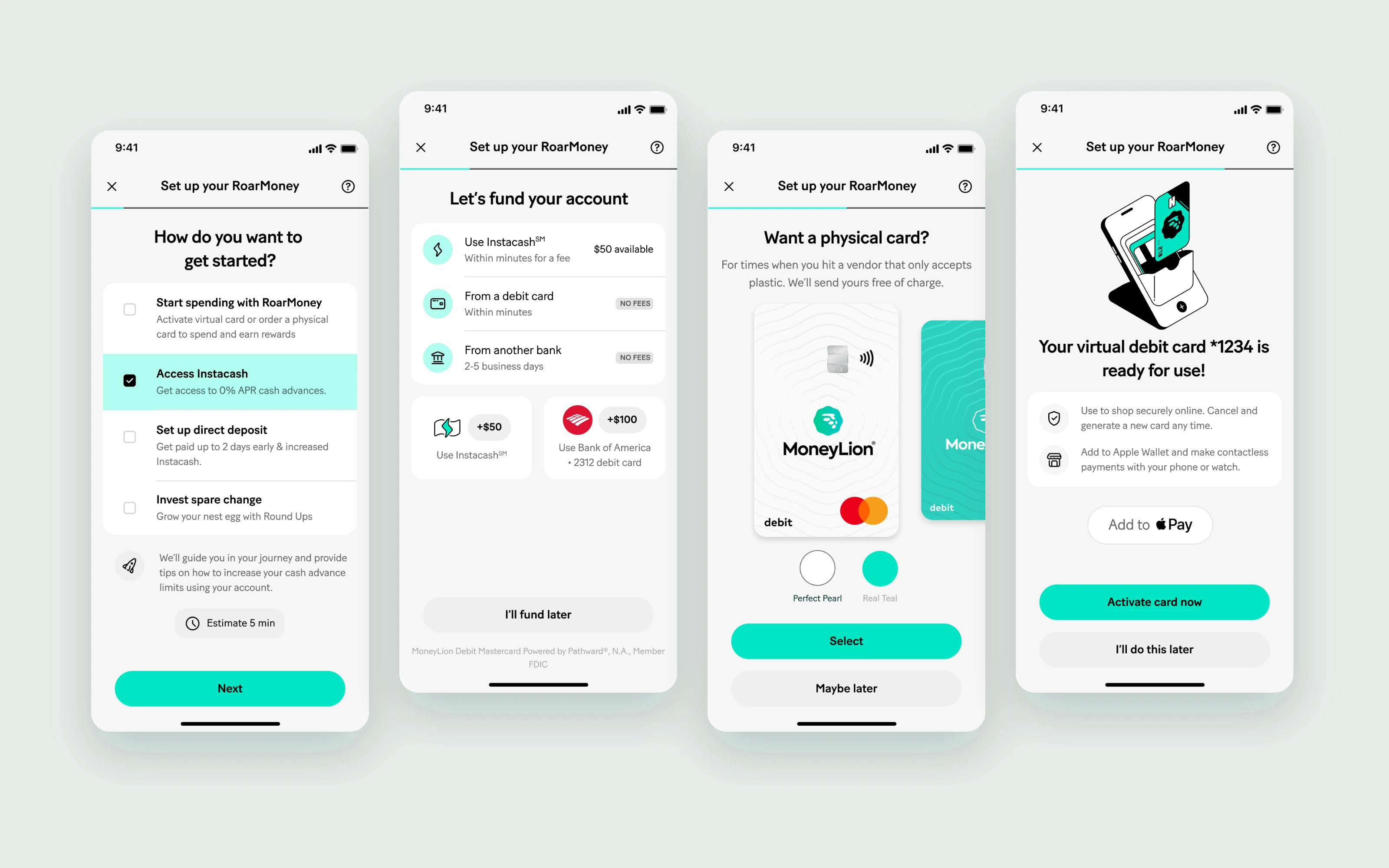
The setup flow begins with a practical question: how do you want to get started? Spending, accessing Instacash, setting up direct deposit and investing spare change are presented as concrete goals.
The following screens break setup into focused decisions. Funding methods show timing and fee information. Card selection includes a way to continue later. Activation explains what the virtual card can be used for.
One decision at a time.
Separate screens give funding, card choice and activation their own space, with a visible progress indicator connecting the journey.
A way to keep moving.
Options to fund or activate later let the flow acknowledge that a customer may not be ready to complete every task in one sitting.
Keep setup visible after sign-up.
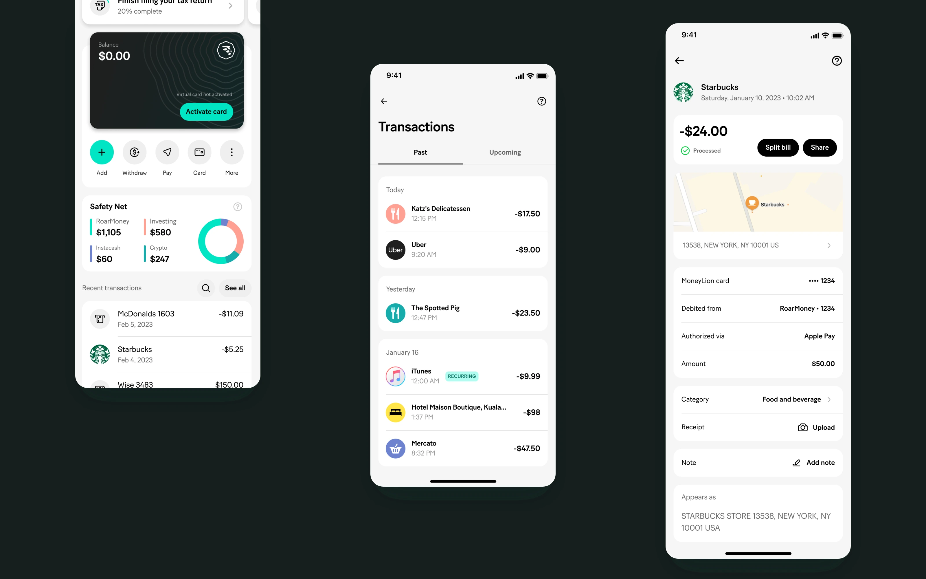
The account experience carries unfinished setup forward. Progress, card status and the next action sit alongside the account balance, rather than disappearing when the initial flow ends.
For everyday use, the hierarchy shifts to common actions and transaction history. Transaction details bring together the merchant, payment status, location and account information, with actions such as splitting a bill or adding a note.
Make the connection between products tangible.
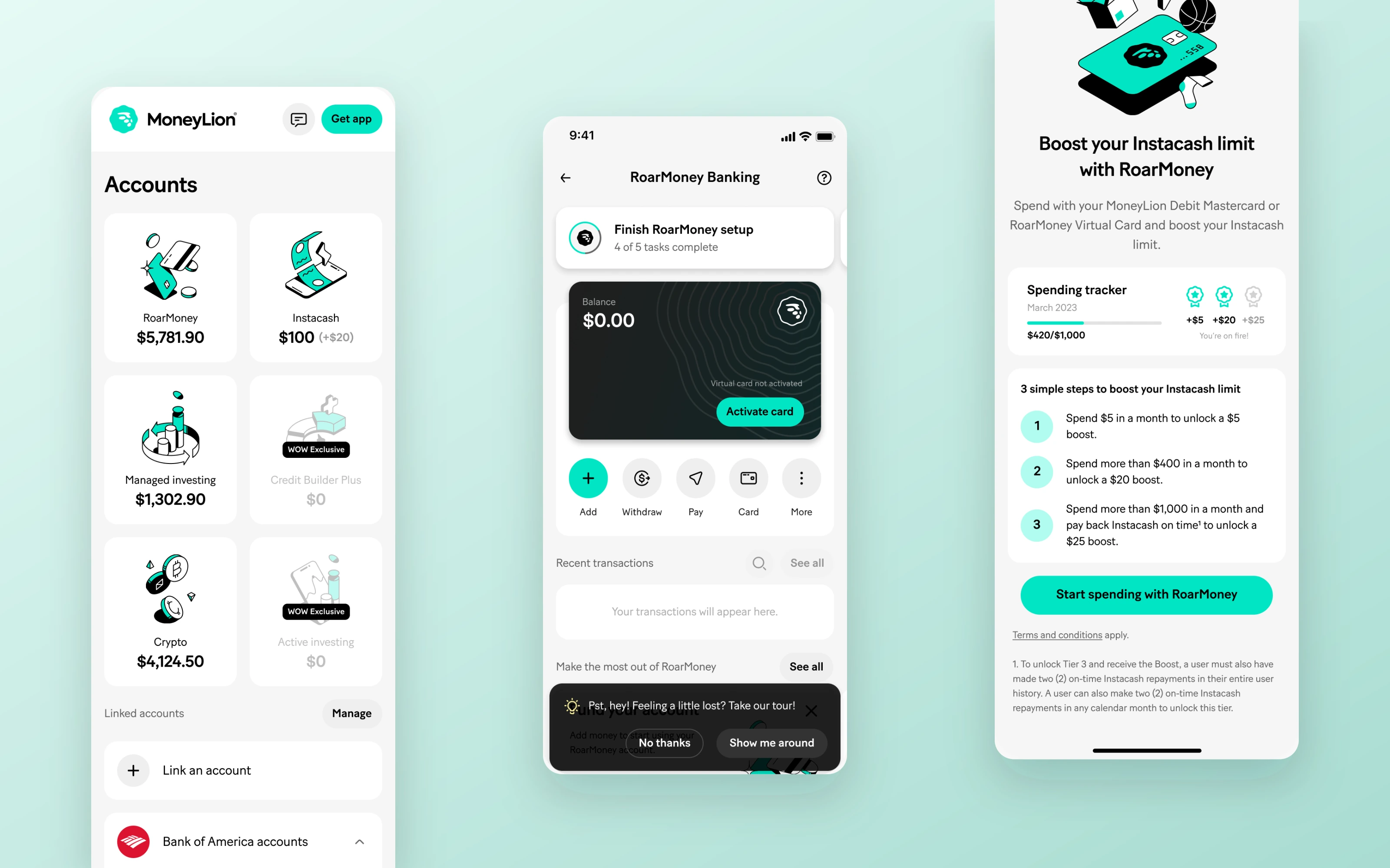
The Instacash material shows how the experience connects back to RoarMoney. Progress tracking and step-by-step explanations make the relationship between qualifying account activity and an increased cash advance limit visible, alongside the conditions that apply.
A broad offer.
A focused starting point.
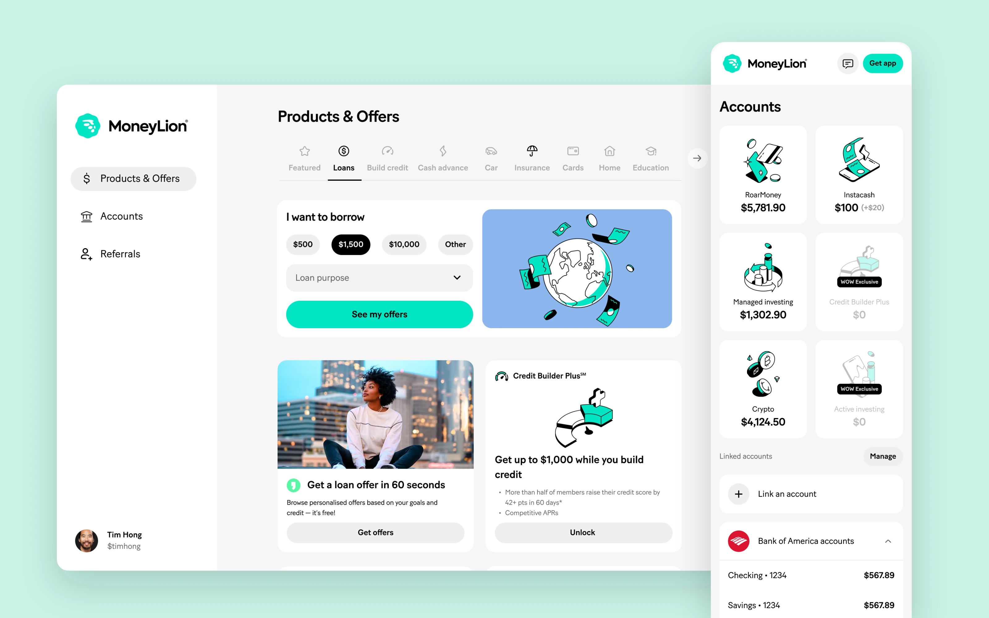
Marketplace brought a wider range of financial products into the experience. The design challenge was to give that breadth a clear structure and help people begin with what they needed.
Let intent lead the interface.
In the lending example, product categories provide orientation, while borrowing amount and loan purpose create a concrete starting point. The primary action sits directly beside those choices.
On mobile web, the navigation separates offers, accounts, referrals and profile. Within accounts, product cards use a consistent structure to show balances and availability, followed by linked external accounts.
Categories for orientation.
Keep the wider offer available without asking every product to compete for attention at the same time.
Hierarchy for action.
Give the immediate task a clear visual priority, with related products and supporting content further down the page.
A recognisable MoneyLion.
Across every touchpoint.
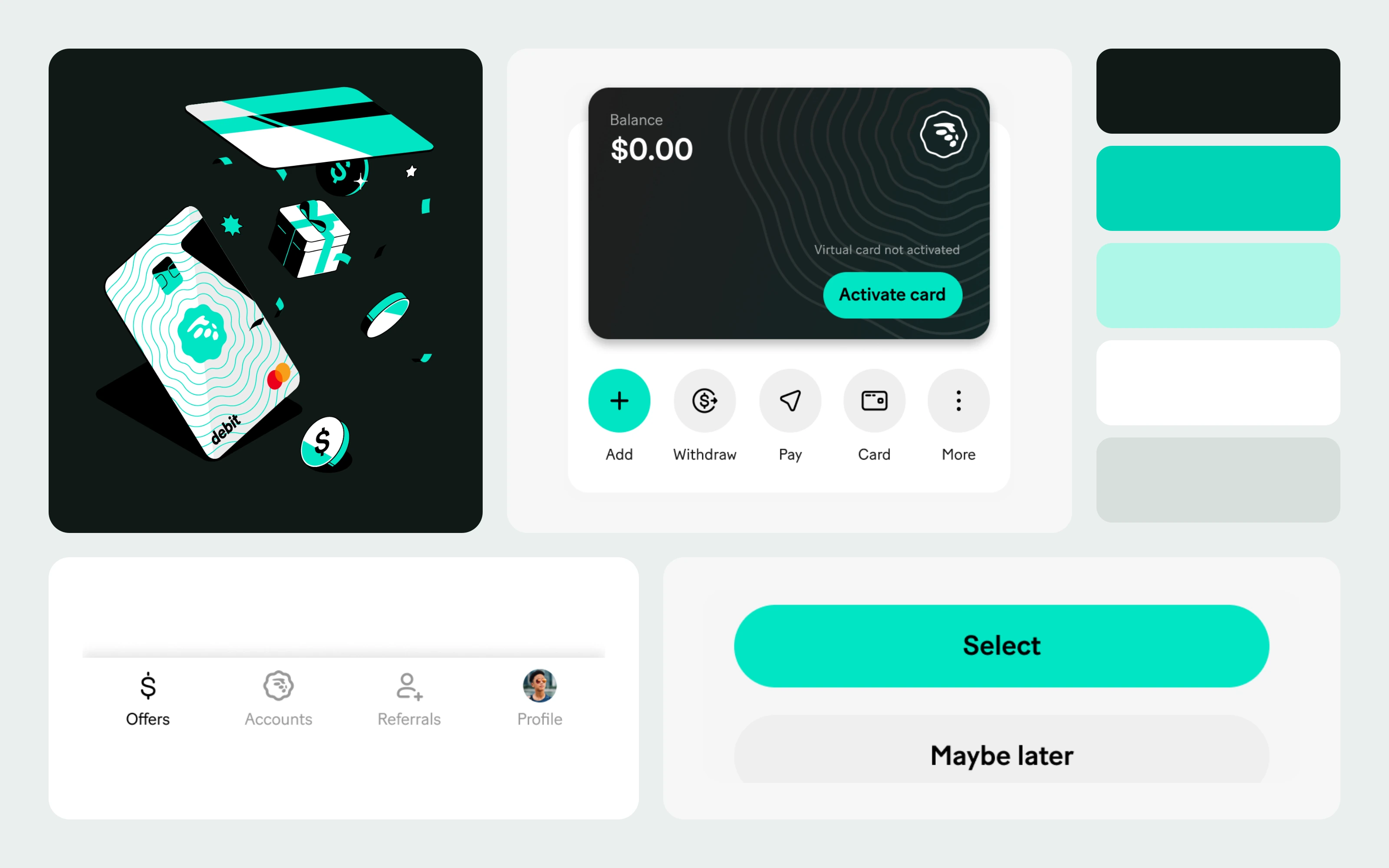
Alongside product journeys, my work included the design system and broader visual direction. Shared controls, navigation and card patterns provided a consistent vocabulary across otherwise different experiences.
The detail is part of the product.
The work shown here pairs a restrained interface structure with MoneyLion’s distinctive colour and illustration style. Strong primary actions, softer secondary choices and familiar navigation help establish a hierarchy that can repeat across products.
That balance matters: a shared design language needs enough consistency to feel familiar and enough flexibility to support different tasks.
Beyond the app.
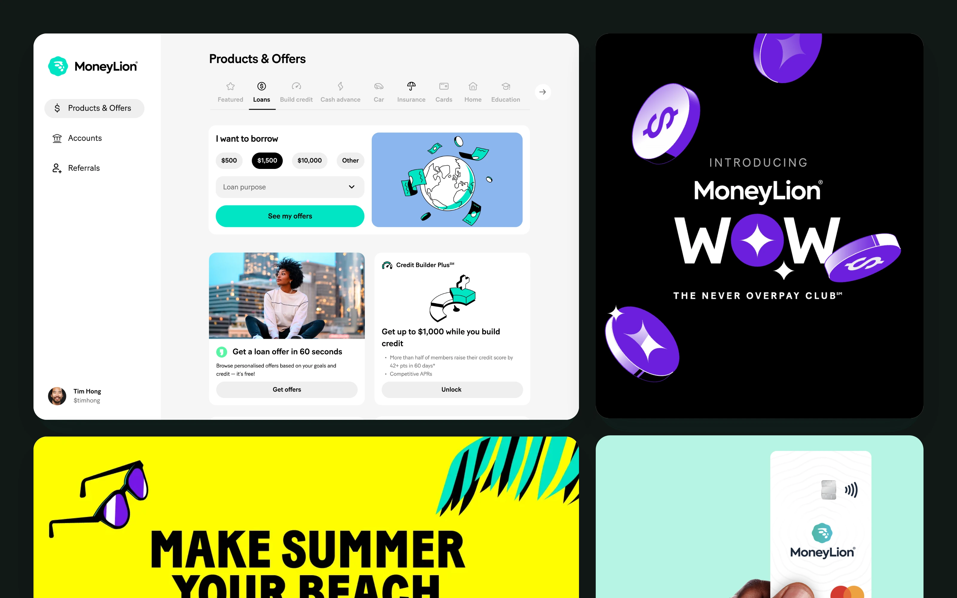
The remit also extended to campaigns and the web presence. Those touchpoints called for a more expressive side of the brand, while keeping a visible connection to the product experience.
My contribution spanned both levels: hands-on design of individual flows and a broader design direction across the MoneyLion ecosystem.