
A fairer way
to stay.
- My roleBrand & design direction
- ScopeIdentity, product direction
& UI refinement - PlatformGuest & host experiences
- ProjectEarlier design direction
AtlasOra began with a simple ambition: make short-term rentals fairer for hosts and guests. The concept centred on clearer pricing, lower fees and a more direct relationship between the people on either side of a booking.
I set the design direction and developed the visual identity, including the logo and colour palette, while also contributing to detailed interface work. Together, we worked to carry the same promise from the first impression into the product.
This case presents an earlier brand and product direction. AtlasOra has since launched with a different design; the work shown here is not used in the current service.
Brand identity, design direction
and detailed UI contributions.
Primary product designer.
Created the majority of the product design.
Product management, with design contributions to the backend and dashboard.
Stay for more.
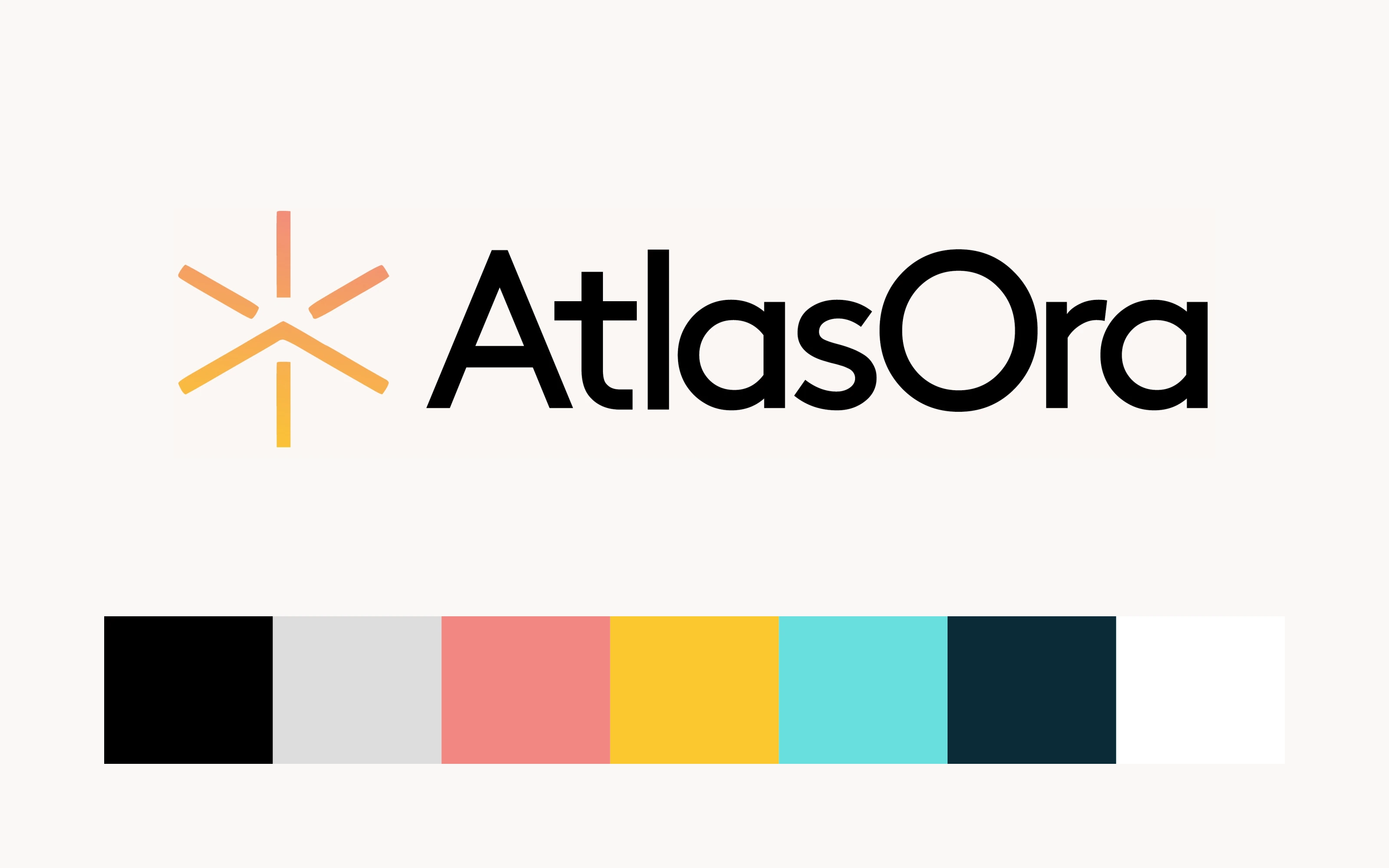
The identity needed to make a new platform feel both credible and inviting. I developed a direction built around a clear wordmark, a radiant symbol and a restrained foundation, with warmth coming through in the accents.
A promise the product could carry.
“Stay for more” brought the proposition into one line: more ease, more transparency and more value from a stay. It gave the brand a direction that could extend beyond a logo, into the language and priorities of the experience.
A quiet neutral base gives photography and typography space. The places, people and experiences can lead.
Coral and yellow bring energy to the identity. Used selectively in the interface, accents help key actions stand out.
Clear enough to trust.
Warm enough to belong.
Get a feel for
the place.
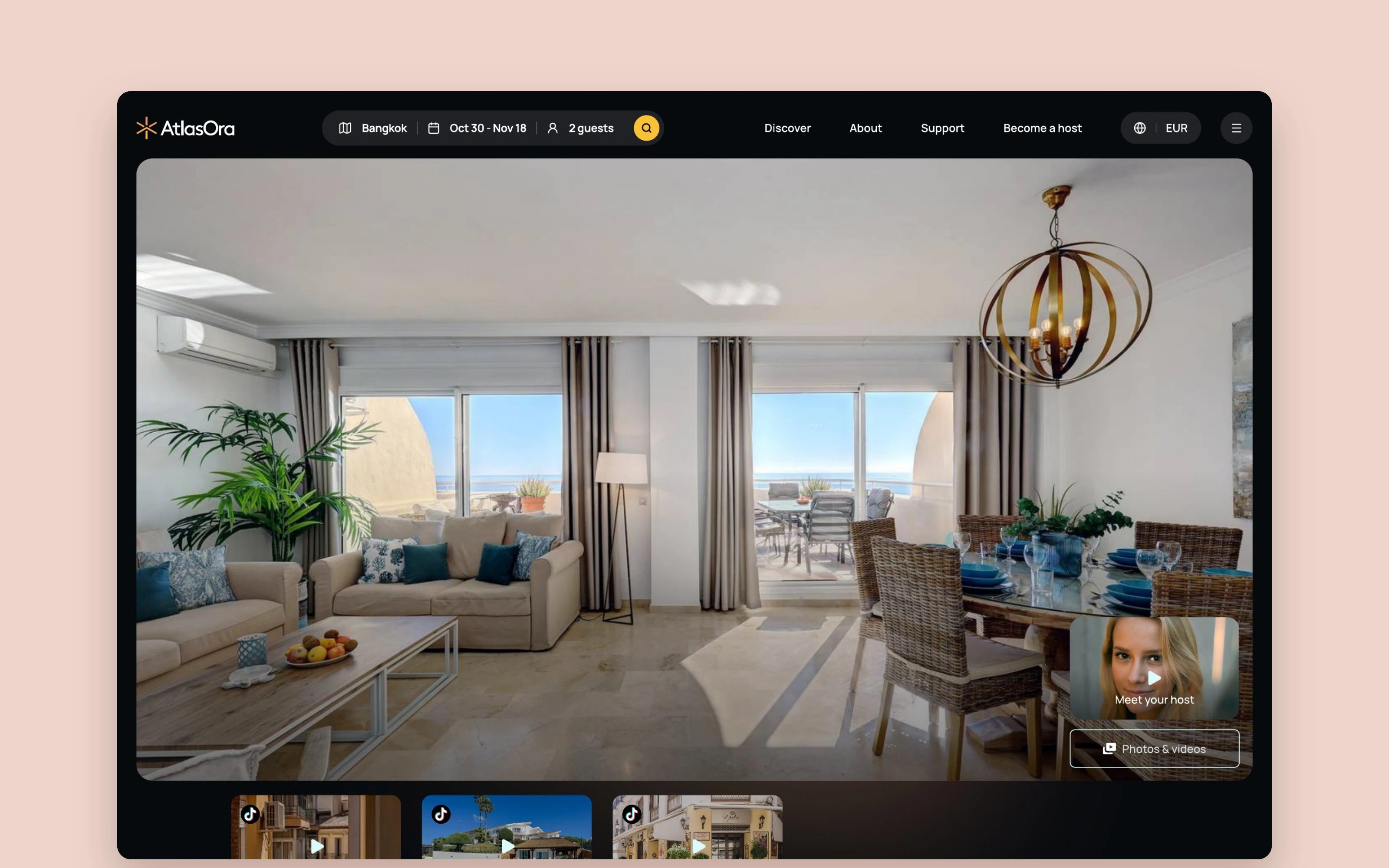
A booking asks someone to commit to a place they have never visited. The listing concept gives that decision more context, bringing together generous photography, video, a host introduction and the practical details of a stay.
Let the place make its first impression.
Large imagery leads the page. Short video previews and “Meet your host” add another way to understand the property and the person behind it. The concept makes room for the surrounding neighbourhood too, helping guests picture the stay beyond the front door.
My role was to help shape the overall direction and refine details alongside Andrew, who created the majority of the product design.
Keep the decision close.
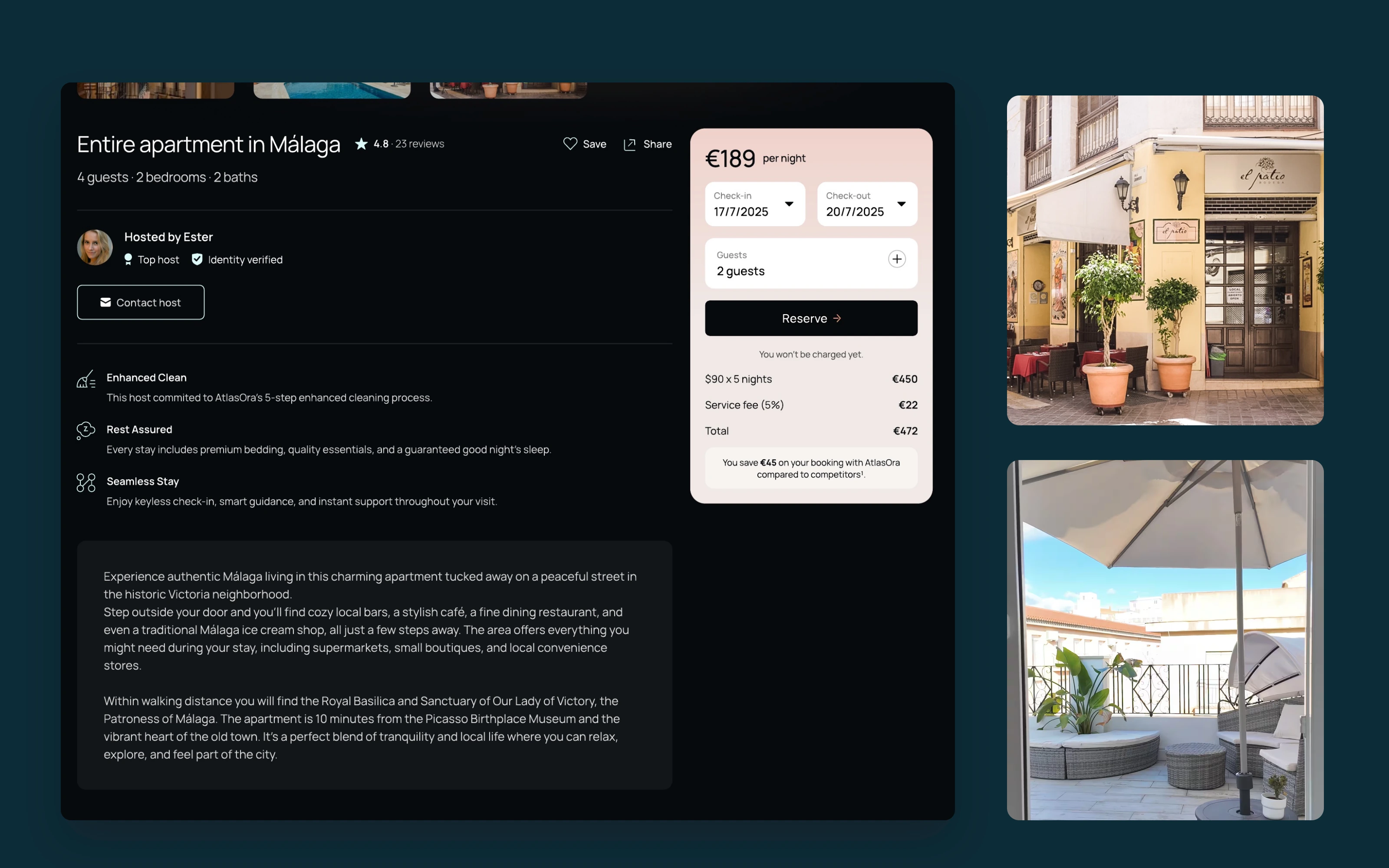
The booking panel groups dates, guest count, the price breakdown and the total beside the listing information. Its contrasting surface gives the next step a clear place on the page.
Host details, reviews, amenities and location provide different kinds of reassurance. Together, they support a considered choice while keeping the booking action within the same experience.
Photography, video and local context help guests imagine being there.
Property details, host information and visible costs help them assess the stay.
A clearer picture
of hosting.
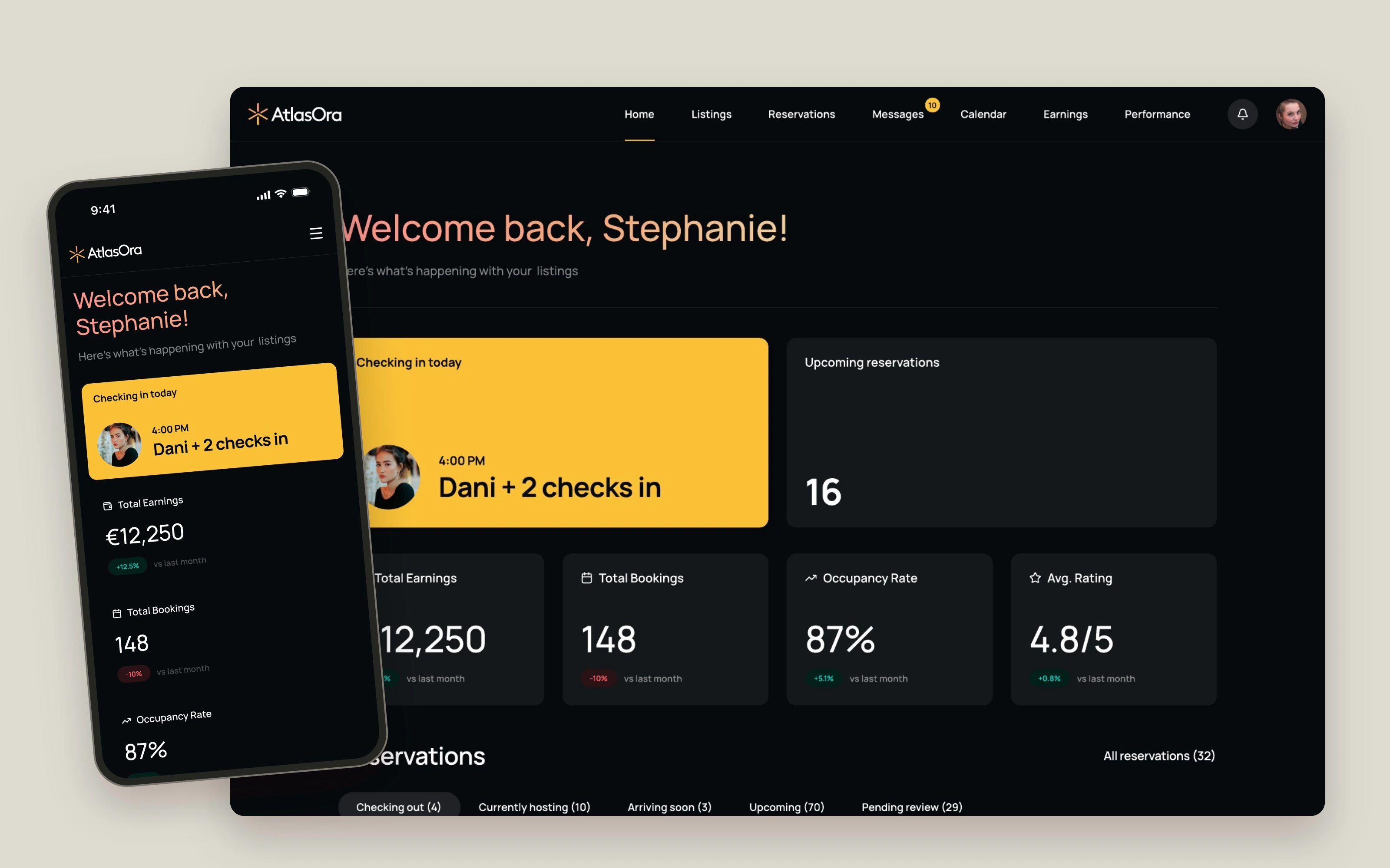
The host side brings a different rhythm: arrivals, reservations, messages and availability. The dashboard concept brings these daily responsibilities together, with a view of what needs attention and routes into the details.
Start with what is happening now.
Arrivals and departures take a prominent place in the overview. Reservations and property cards sit alongside summary figures, connecting the day’s work with the wider picture of the host’s listings.
The shared visual direction carries into both desktop and mobile. Mathias contributed to backend and dashboard design alongside his role as PM.
Keep the conversation connected.
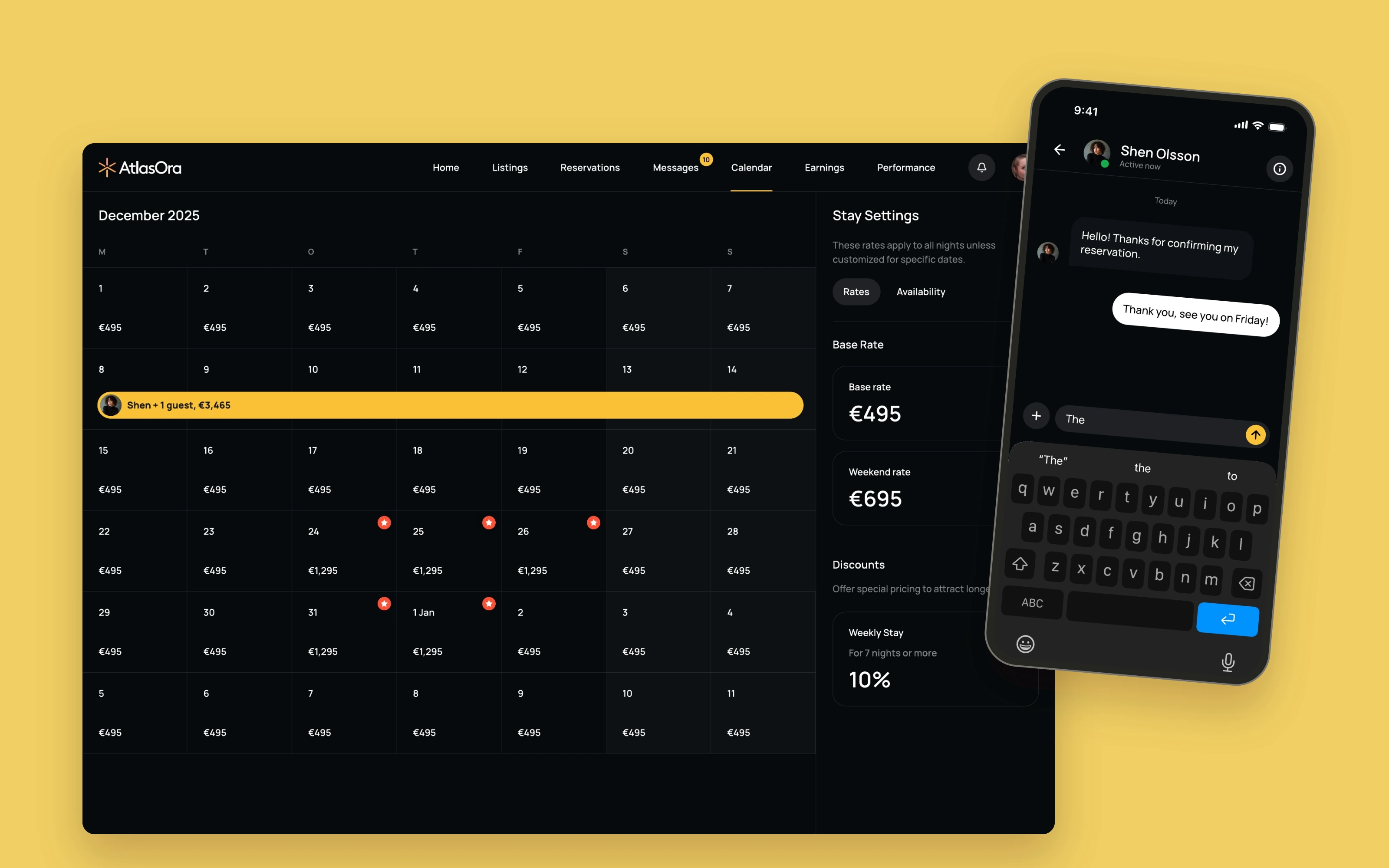
The calendar gives availability its own clear overview. Messages bring guest communication together with access to reservation details, keeping the conversation close to the stay it concerns.
Give every step a clear job.
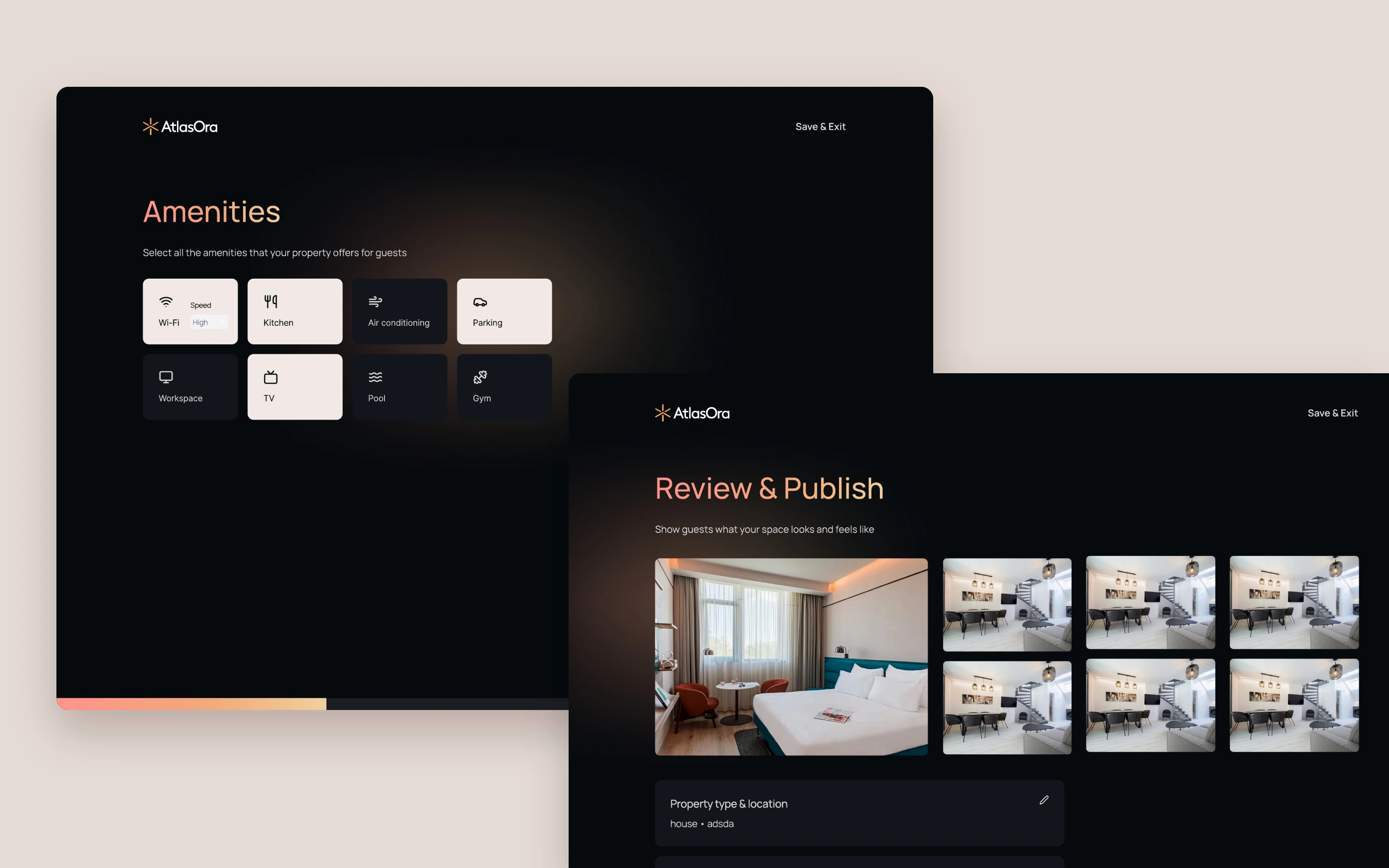
Creating a listing is split into focused stages: property details, amenities, photos and videos, then review and publication. Each view asks for a manageable set of information and shows a clear next action.
The work brought a brand direction and a broad product concept into the same conversation. It remains a useful expression of how I work: establish a clear identity, guide the experience and collaborate closely on the details that make it coherent.
Let’s make
something incredible.
Have a product to shape or an experience to rethink? Let’s talk.
Book a 30-minute call ↗